Contact Us Terminal Design Inc.             125 Congress Street   Brooklyn, NY 11201         718 246 7085
Terminal Design was founded in 1990 by me, James Montalbano, and is located on the terminal moraine in Brooklyn, NY. Hence the name.
I originally specialized in custom typeface, lettering and logo design, and have been fortunate to have my worked commissioned by some well known publications and companies. Doing that custom work allowed me time to develop a retail font library which has grown to over 800 individual fonts. All designed, drawn and spaced by me I named almost all of them myself as well.
My professional career began as a public school industrial arts teacher, trying to keep my young students from crushing their hands in the platen presses. Having to teach wood shop was the last straw and I quit and went to graduate school. After receiving an M.Ed in Technology Education, I studied lettering with Ed Benguiat, began drawing type and working in the wild world of New York City type shops and magazine art departments. My career continued as a magazine art director, moving on to become a design director responsible for 20 trade magazines whose subject matter no one should be required to remember. I was talked into designing pharmaceutical packaging, but that only made me ill. When my nausea subsided, I started Terminal Design, Inc. and I haven’t been sick since.
Since 1995 I have been working on the Clearview type system for text, display, roadway and interior guide signage. In 2004 the 13 font ClearviewHwy family was granted interim approval by the Federal Highway Administration (FHWA) for use on federal roadways. It has now been over 10 years and when it gets granted permanent approval is anyone’s guess.
My work has been featured in The New York Times, Print, Creative Review, ID, Wired, and is in the permanent collection of the Smithsonian Cooper-Hewitt National Design Museum.
I’m a past president of the Type Directors Club (TDC), and have taught typography at Pratt Institute and type design at School of Visual Arts (SVA). I currently teach undergraduate type design at Parsons School of Design in New York City.

NPS Roadway

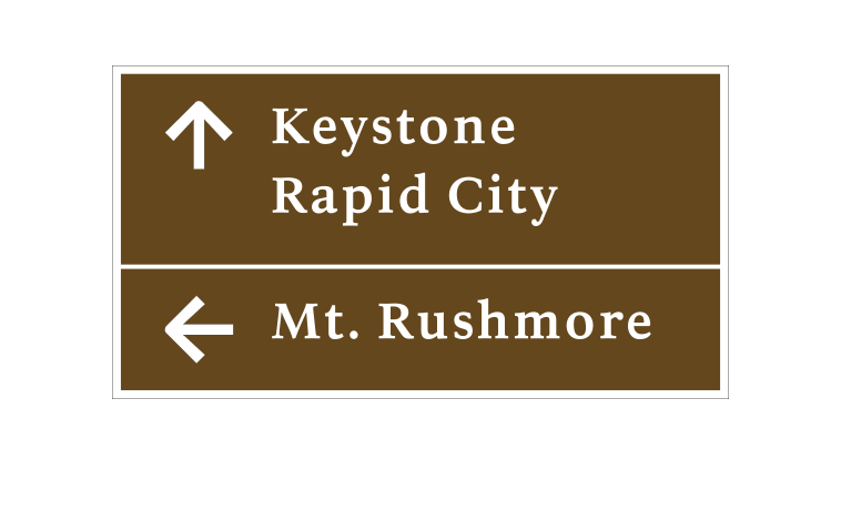
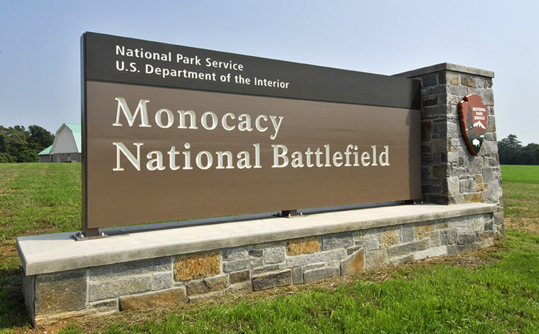
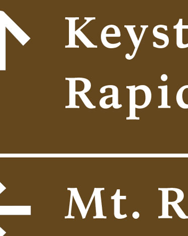
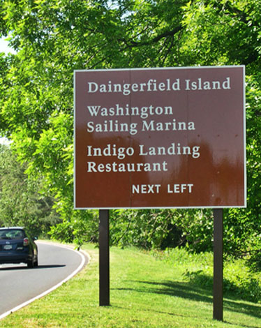
Designed to replace the Clarendon road guide sign typeface that the U.S National Park Service used as part of their identity. NPS Roadway was tested by Pennsylvania Transportation Institute and was found to decrease legend length by 10-15% while increasing readability by 11%. Part of a total redesign of the Park Service identity (that included the Rawlinson series of fonts) the font has been approved by FHWA (Federal Highway Administration) for use on all Federal roads.


  BUY FONT »