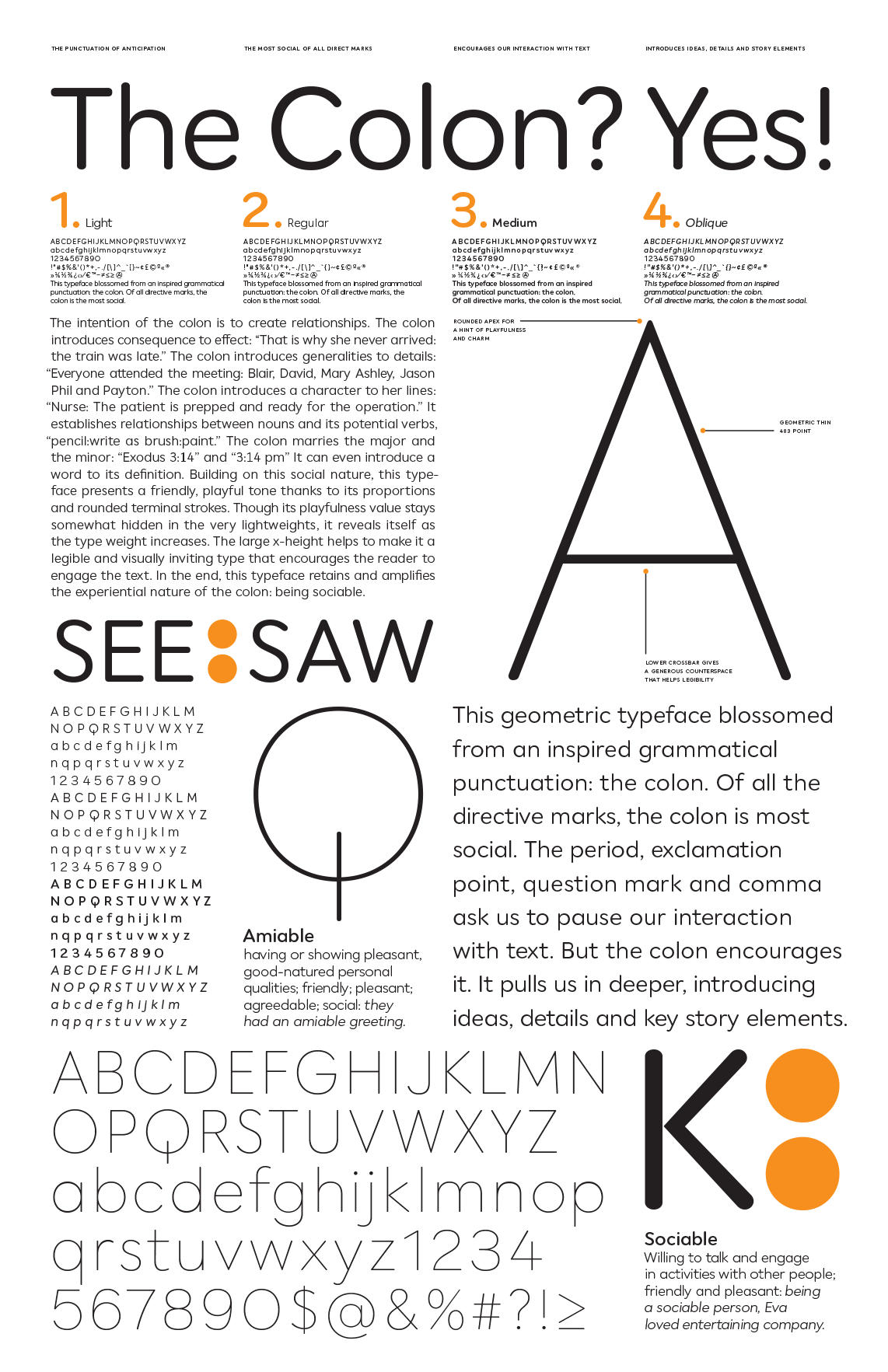
Collins Geometric
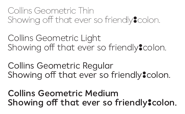
Our good friend John Fulbrook asked us to help him realize his idea for a new corporate typeface. He talked about modifying some existing typefaces that he liked, but we convinced him that a completely new and original design would be the best way to go. This simple geometric sans with round terminals captures the friendly personality that John was looking for. The extra bold colon, key to Collins’s new identity, is accessed by typing two colons in sequence and having the contextual alternate OpenType feature substitute the bold colon automatically.
John Fulbrook | Design Director
