Barneys New York
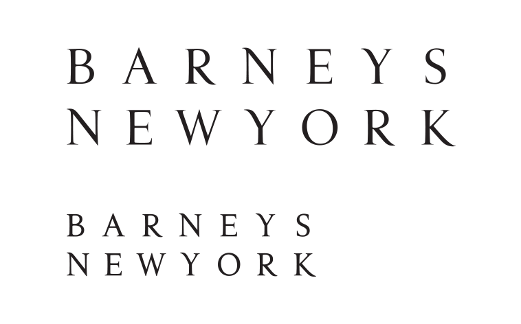
Barneys New York noticed that their venerable old logo was looking pretty bumpy and worn so they called me in to take a look at it. I examined their digital artwork and it looked like it had been auto traced from an old scan in 1993! I redrew it and cleaned it all up and in the process created two versions. One finely drawn and delicate for large scale applications and another chunky version to hold up well at small sizes.
Scott Williams | Design Director


