Chicago
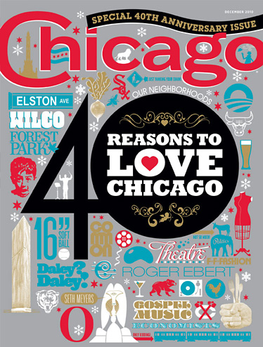
Art director Jennifer Moore asked me to freshen up the Chicago Magazine logo. I removed all of the inlines, outlines, shadows & dimensions and came up with this stronger, bolder version. The logo was used from August 2007 until October 2013. In November 2013 it was changed to an all caps, incredibly boring logo that is still currently in use. Sometimes there is no accounting for taste.
Jennifer Moore | Art Director
